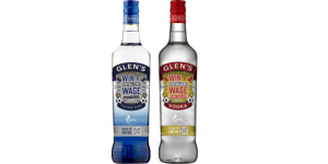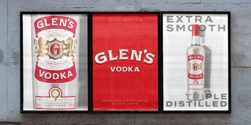
Scottish vodka Glen’s has unveiled its first major brand refresh in almost 20 years, as it aims to target growth in new markets.
The Loch Lomond Group-owned brand’s new bottle design seeks to celebrate its Scottish provenance while overcoming its “drifting sense of identity”.
The red, white and gold palette remain, as do lions on the brandmark, but they have been recrafted to amplify Glen’s taste experience, along with a simplified monogram and the addition of a quality panel.
In addition, refreshed and modern typography against the core palette aim to underpin provenance as the basis for Glen’s off-pack brand and product messaging – ‘Proudly Original’, ‘Extra Smooth’, ‘Triple Distilled’, and ‘Produced and Bottled in Scotland’.
“For over 20 years Glen’s has been part of the fabric of Scottish culture, synonymous with so much of what the nation is famous for – its sense of wit and fun,” Thirst’s Creative Director Matt Burns said.
“Yet with ongoing fragmentation and a drifting sense of identity affecting quality perception and impeding growth, it was time to reassess the brand direction.
“We wanted to move it away from emulating inauthentic provenance and instead take pride and confidence in its own roots, at the same time retaining its distinct demeanour and straightforward quality that appeal to smart, value-seeking consumers and bring a refreshing lift to the category.”